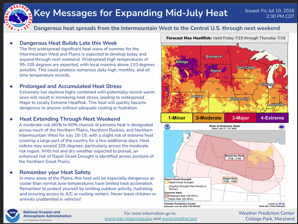
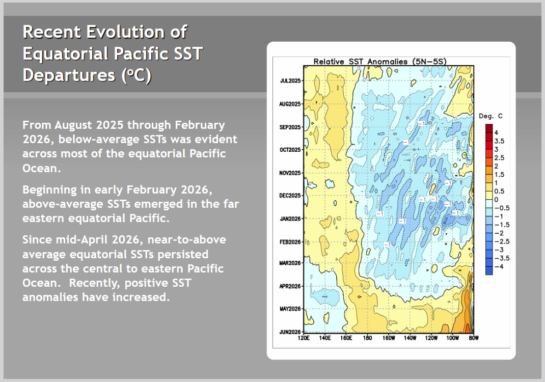
As usual, we begin with important weather news when it is available.
Now to the main topic of this article.
Part I. Here is the Official Release
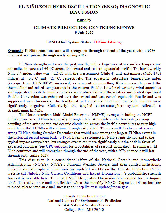
The second paragraph in the CPC discussion is what is important:
The North American Multi-Model Ensemble (NMME) average, including the NCEP CFSv2 , forecasts El Niño to intensify through 2026. Alongside model forecasts, a strong coupling of the atmospheric and oceanic circulation across the Pacific contributes to very high confidence that El Niño will continue through early 2027. There is an 81% chance of a very strong El Niño during October-December that would rank among the largest El Niño events in the historical record going back to 1950. Even the strongest El Niño events do not lead to the typical impact everywhere, but stronger events can more significantly tilt the odds in favor of expected outcomes (see CPC outlooks for probabilities of seasonal anomalies). In summary, El Niño continues and will strengthen through the end of the year, with a 97% chance it will last through early spring 2027.
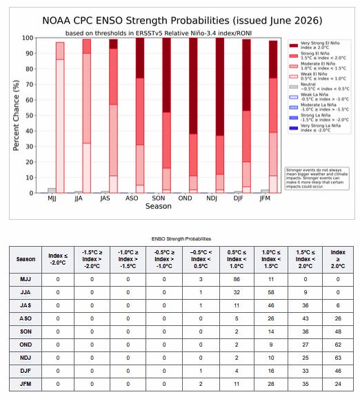
Here is what was said last month.
The North American Multi-Model Ensemble (NMME) average, including the NCEP CFSv2, forecasts El Niño to intensify into the Northern Hemisphere winter 2026-27. High confidence in El Niño is also linked to anomalously high oceanic heat content and expanding westerly wind anomalies across the equatorial Pacific Ocean. There is a 63% chance of a very strong El Niño during November-January that would rank among the largest El Niño events in the historical record going back to 1950. Even very strong El Niño events do not lead to the expected impact everywhere, but stronger events can more significantly tilt the odds in favor of expected outcomes (see CPC outlooks for probabilities of seasonal anomalies). In summary, El Niño conditions are present and expected to strengthen into the Northern Hemisphere winter 2026-27.
Notice that the timing has been moved up. Last month, we commented on the speed of the warm anomaly moving east and wondered if it would move out of the picture prior to winter. So this is somewhat of a Fall El Niño, which is interesting. I am still somewhat skeptical of their analysis. But one of the graphics I present makes a very strong El Niño possible.
CPC Probability Distribution
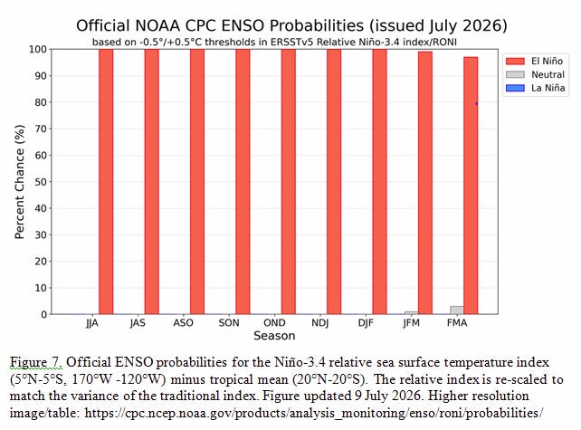
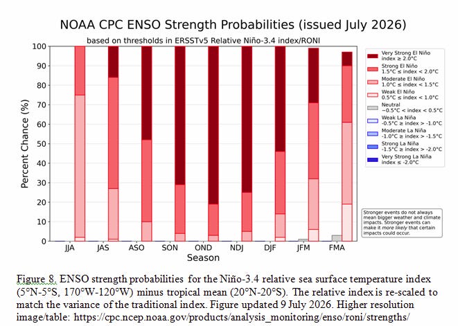
Here are the new forecast probabilities:
There is not much doubt that we are in El Niño conditions and they will last into next Spring.
The probabilities are for three-month periods, e.g. JJA stands for /June/July/August. It may not be scientific, but I pay attention to the middle month in these three-month probability assessments. El Niño is here.
Strength Probabilities.
Current Analsyis
That is pretty ominous for September through January. Being as strong as indicated for September, I believe, is unusual.
Last Month Analysis.
The current assessment is a big change from last month. In Part II, I will explain why I think their assessment is possibly correct and possibly incorrect. At this point, being strong is pretty much a given. Being very strong is still uncertain. Of much interest is just how high the Niño 3.4 will be.
It is important to remember that:
A. Impacts are not always correlated with the Niño 3.4 levels (which, when averaged over time, become ONI readings).
B. Impacts will vary worldwide.
Part II. Additional information we might want to look at.
There is much information we might want to look at, but these are a small number of graphics that I find especially useful.
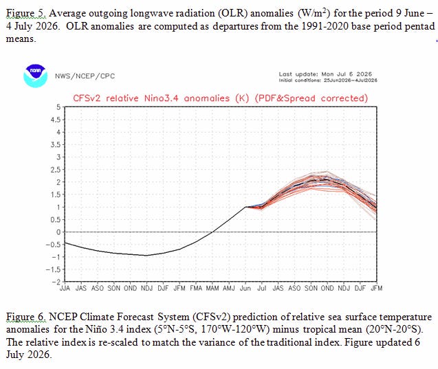
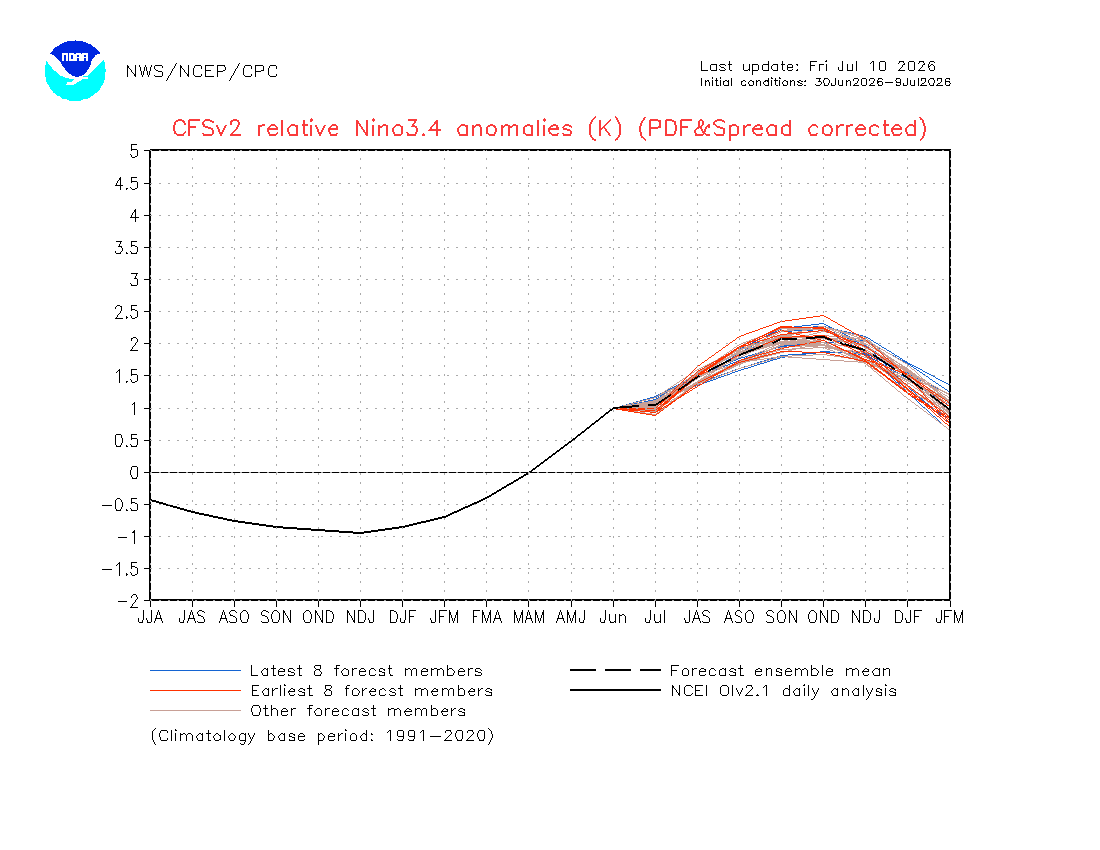
Here is the NOAA Proprietary Model, but it is soon to be updated/replaced.
Notice it is dated July 8, so it is not the latest information. I have access to the latest information, but I am having trouble matching what was sent out with what I have, as there are many options. But looking at the above, I now see a very strong El Niño. That is especially true in terms of the more recent runs. It does not look like it is substantially over 2.0C to me. But it is now over 2.0. But not for many months.
Here is what I found when I tried to update this model run on Thursday. I am not 100% sure I picked the same version, but I think I did. (LINK)
It is now showing the Niño 3.4 Index over 2.0C. The red lines are older runs of the model. The spread among model runs is tight, possibly adding confidence to the results. It is not the only tool NOAA/CPC uses, but they provided it with their analysis.
Looking at other information.
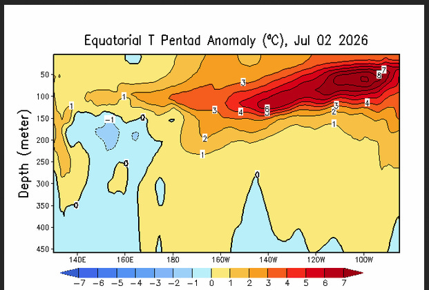
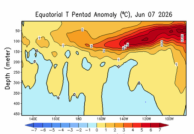
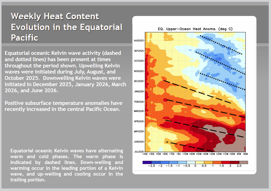
The view below is from the surface down. ENSO (and the interaction with the atmosphere) is determined at the surface, but the subsurface is a clue to the future. We are mostly interested in 170W to 120W. You can see the anomalies at the surface, but these will soon be replaced by water from below for a number of reasons. Usually, the discussion is in terms of anomalies, i.e., changes from normal. But absolute values are also important. ENSO is defined in terms of sea surface temperature anomalies and the impact on the atmosphere.
Current
Prior Month
It stopped moving east or was reinforced from the west. Will water warmer than 2C (anomaly) be on the surface during the winter? This water is running into Ecuador and cannot continue to move east, so it may rise to the surface, but will it be in the Niño 3.4 measurement area?
The warm temperature anomaly of the water at depth is greater than last month; hence, the forecasts are potentially more dire in terms of the strength of the coming El Niño.
Traditionally, we measured the strength of ENSO cycles in an area called. Nino 3.4. A warming ocean may make that less than optimal.
Current Niño 3.4 readings are now adjusted and are called Relative Niño 3.4 Readings. Here is the formula which seems to do nothing: “NCEP Climate Forecast System (CFSv2) prediction of relative sea surface temperature anomalies for the Niño 3.4 index (5°N-5°S, 170°W-120°W) minus tropical mean (20°N-20°S). The relative index is re-scaled to match the variance of the traditional index.” I do not understand the last sentence in the calculation. I have read the documentation on this Relative Index, but I do not understand the logic for this last step since warming has taken place over time and “rescaling” makes me nervous. One goal is to be able to compare current events with prior events. As an example, is an index value of 2.2 with the new method equivalent to an index value of 2.2 using the prior method? If so, why change the method? They are not the same. So I am pretty sure the historical values were recalculated using the new method. That makes sense to me. It is the rescaling that I do not understand. I gather the purpose of this step is to have the new values be distributed in a way similar to the old values, i.e., match the variance of the old values. I am not sure about this part of the procedure. I am quite sure that this modification of the index will be changed fairly quickly. It may or may not be an improvement. But it is not, IMO, what really needs to be done. It may take some time to sort this out, and if the oceans continue to warm, we may never be able to catch up with how the phases and strength of the phases of the ENSO cycle are best determined.
From what I can tell, this decision was not based on science but on intuition. All of this reduces the level of confidence one might have in the categorization of this ENSO event. I am not being negative, just informing readers that ocean warming has made tracking and interpreting the ENSO cycle more difficult.
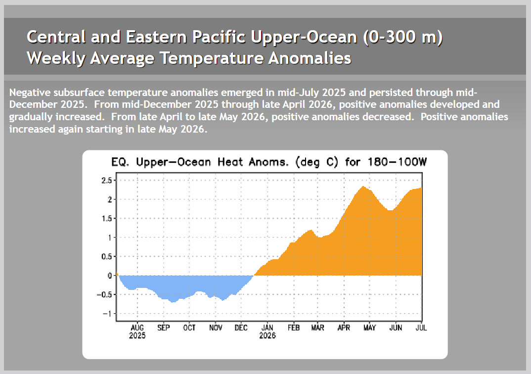
Here, we integrate the anomalies from 300 meters deep to the surface. Again, you can see the La Niña period and the change as warm anomalies have developed. The graphic covers from the Date Line (180W) to 100W, but we are most interested in 170W to 120W, which is close enough, sort of. Have we peaked? I think it had peaked, above does not tell us for sure what the surface temperature anomaly will be. But seems that the dip in the temperature anomalies was temporary.
Again, we care about two things:
A. The temperature anomaly at the surface and
B. Does the atmosphere react to this and change the location of the Walker circulation?
The overall warming of the Pacific has complicated the matter. Are our criteria still valid?
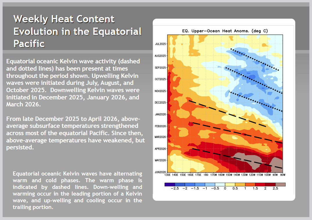
Looking at Kelvin Waves
This week
Last Week
Last week, looking to the west, I saw no sign of a subsequent Kelvin Wave. But another one developed anyway. This was unexpected, but in theory moved more warm water east, raising the Niño indices and perhaps increasing the subsurface warm anomaly water to fuel the development of this El Niño.
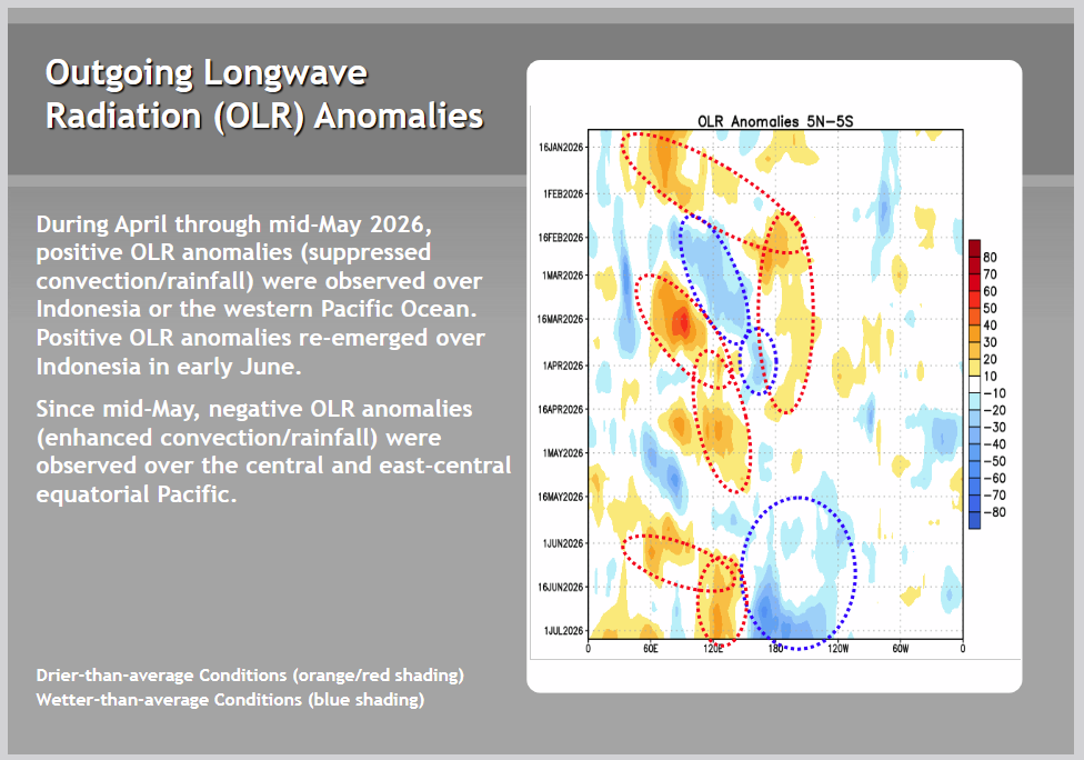
OLR Analysis
It is not exactly the same as SOI analysis (LINK), but in the Hovmöller diagram, you can see that clouds have formed where you expect them to form during El Niño. It is a lot clearer this week.
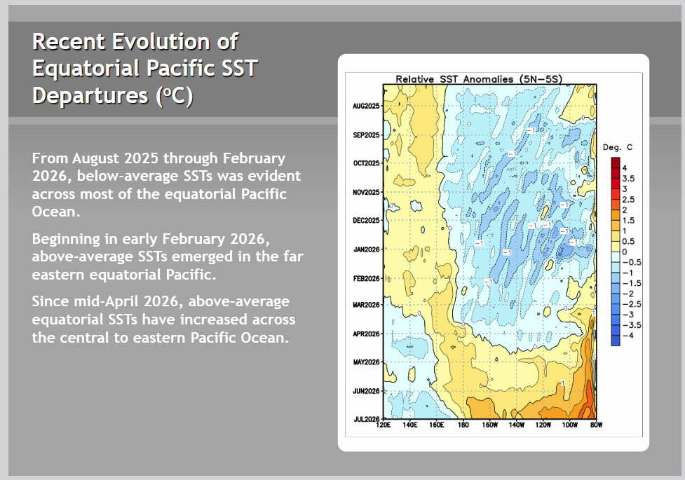
Another way of looking at things.
This Week
Last Week
This Hovmöller diagram shows that the water temperature anomaly in the Niño 3.4 measurement area has risen from 0.5C to 1.0C. That is not greater than 2.0C. Greater than 2.0C gets you to a Very Strong/Super El Niño, but that is not expected until winter. Will it happen? I think it might, but I have not yet concluded that the odds of that happening are 63%. And if it does happen, IMO it is more likely to be 2.2C or less rather than higher than 2.2C.
So you can clearly see the week-to-week change. The surface is warmer.
Part III. New Drought Data Access Product
News & Events
The Drought Data Dashboard (D3): A System for Open, Transparent, and Local Drought Monitoring
Published on July 8, 2026 Author: Zach Hoylman, Montana Climate Office
When drought intensifies, decisions cannot wait. Ranchers decide when to move livestock, water managers balance reservoir operations, and emergency managers coordinate drought response. Yet the information guiding those decisions is often scattered across multiple websites, difficult to compare, and challenging to translate into action.
To help close that gap, the Montana Climate Office has launched the Drought Data Dashboard (D3, pronounced “D three”), a free, open-source web platform that delivers daily drought information across the contiguous United States. Designed for drought assessors, producers, water managers, researchers, and the public, D3 brings together leading drought datasets into a single interactive platform while making every method, dataset, and line of code accessible and transparent.
D3 is the culmination of nearly a decade of collaboration. The platform grew from the Upper Missouri River Basin Drought Dashboard, developed after the 2017 Northern Plains flash drought exposed the need for more transparent and accessible drought information. With support from NOAA’s National Integrated Drought Information System (NIDIS), the Montana Climate Office worked closely with the Montana Department of Natural Resources and Conservation (DNRC); Montana’s Governor’s Drought and Water Supply Advisory Committee (DWSAC); agricultural producers; federal, Tribal, and state partners; and other collaborators to build a tool around real operational needs. Rather than developing technology first and searching for applications later, the dashboard evolved through continuous feedback from the people responsible for drought monitoring, planning, and response. The new dashboard will serve as a forum for enhanced coordination and co-development of modern drought assessment approaches through the National Science Foundation (NSF) sponsored Northern Great Plains Regional Resiliency Incubator in Drought Resiliency (NGP RIDR).
“D3 provides transparent, science-based drought information in a format that helps producers, water managers, and drought assessors make informed decisions,” said Michael Downey, Drought Program Coordinator at the Montana DNRC and D3 collaborator and co-producer. “It’s an important step forward for drought monitoring and collaboration.”
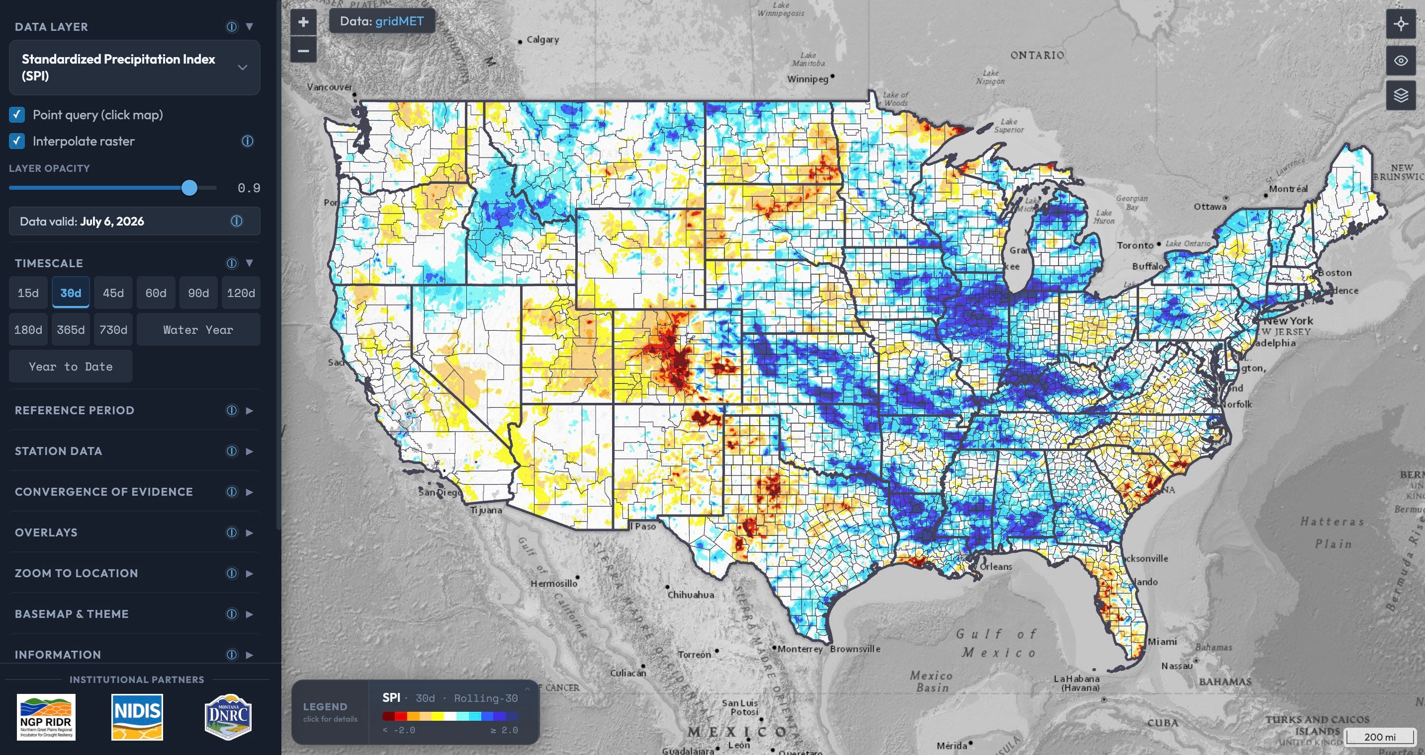
Today, D3 provides daily drought information across the contiguous United States. Users can explore precipitation, atmospheric demand, temperature, snowpack, streamflow, and multiple drought indicators across timescales ranging from 15 days to 2 years. They can compare conditions across space and time, retrieve values for any location, overlay U.S. Drought Monitor classifications and administrative boundaries, and incorporate observations from United States Geological Survey (USGS) streamgages and thousands of Global Historical Climatology Network (GHCN) climate and weather stations.
The Drought Data Dashboard (D3) allows users to explore precipitation, atmospheric demand, temperature, snowpack, streamflow, and multiple drought indicators across the contiguous U.S.
Several innovations distinguish D3 from traditional drought monitoring platforms. Users can choose among multiple climatological reference periods, including a rolling 30-year baseline, the World Meteorological Organization’s 1991–2020 climate normal, and the full period of record, making processes like aridification something users can explore rather than simply read about. The dashboard also includes a Convergence of Evidence tool that allows users to combine multiple drought indicators into a single composite map with reproducible and transparent methods, reflecting the way climatologists evaluate drought by considering multiple lines of evidence instead of relying on a single index. Regional datasets, including observations from state mesonet weather and soil moisture networks, can also be integrated through flexible plugin architecture that allows local information to appear seamlessly alongside national products.
Beyond visualization, D3 serves as an operational data platform. Every layer is published as a Cloud-Optimized GeoTIFF and can be accessed directly from GIS software, R, Python, or other scientific workflows. Whether someone wants to view conditions on a smartphone, prepare a drought assessment, or build a new application, everyone is working from the same openly available information.
The dashboard also provides a foundation for future decision-support tools created by the larger drought monitoring community. As new products become operational, including knowledge-guided machine learning predictions of streamflow and soil moisture developed through the RIDR, they can be integrated directly into the D3 platform. Continued expansion of D3 is supported through ongoing partnerships, including the NSF NGP RIDR, NOAA/NIDIS, and recent Congressionally directed spending secured by the office of Senator Tim Sheehy.
“NIDIS and the Montana Climate Office have been working together for almost 10 years to transform how we understand and respond to drought,” said Veva Deheza, NIDIS Executive Director. “By consolidating complex climate datasets into a single, transparent, and open-source platform, the Drought Data Dashboard empowers everyone—from ranchers and water managers to the general public—to make confident, evidence-based decisions when it matters most.”
The release of D3 comes as the drought community is increasingly focused on modernizing drought assessment. The recently released National Academies of Sciences, Engineering, and Medicine consensus study, Improving Future U.S. Drought Assessment, calls for drought assessments that integrate multiple lines of evidence, use transparent and reproducible methods, and better account for climate nonstationarity.
At its core, D3 is built on the idea that drought information should be treated like public infrastructure: open, transparent, and available to everyone who depends on it. The platform was shaped through years of engagement with the drought community and designed around the practical needs of drought assessment and decision-making. Whether someone is managing a ranch, allocating water, preparing for wildfire, or conducting research, they should be able to access the same high-quality information, understand how it was produced, and use it with confidence.
The Drought 9*Data Dashboard is available free of charge at d3drought.org.
Part IV: The Monthly Copernicus Climate Change Report.
Copernicus: Record heatwave brings hottest June for western Europe during second-warmest June globally
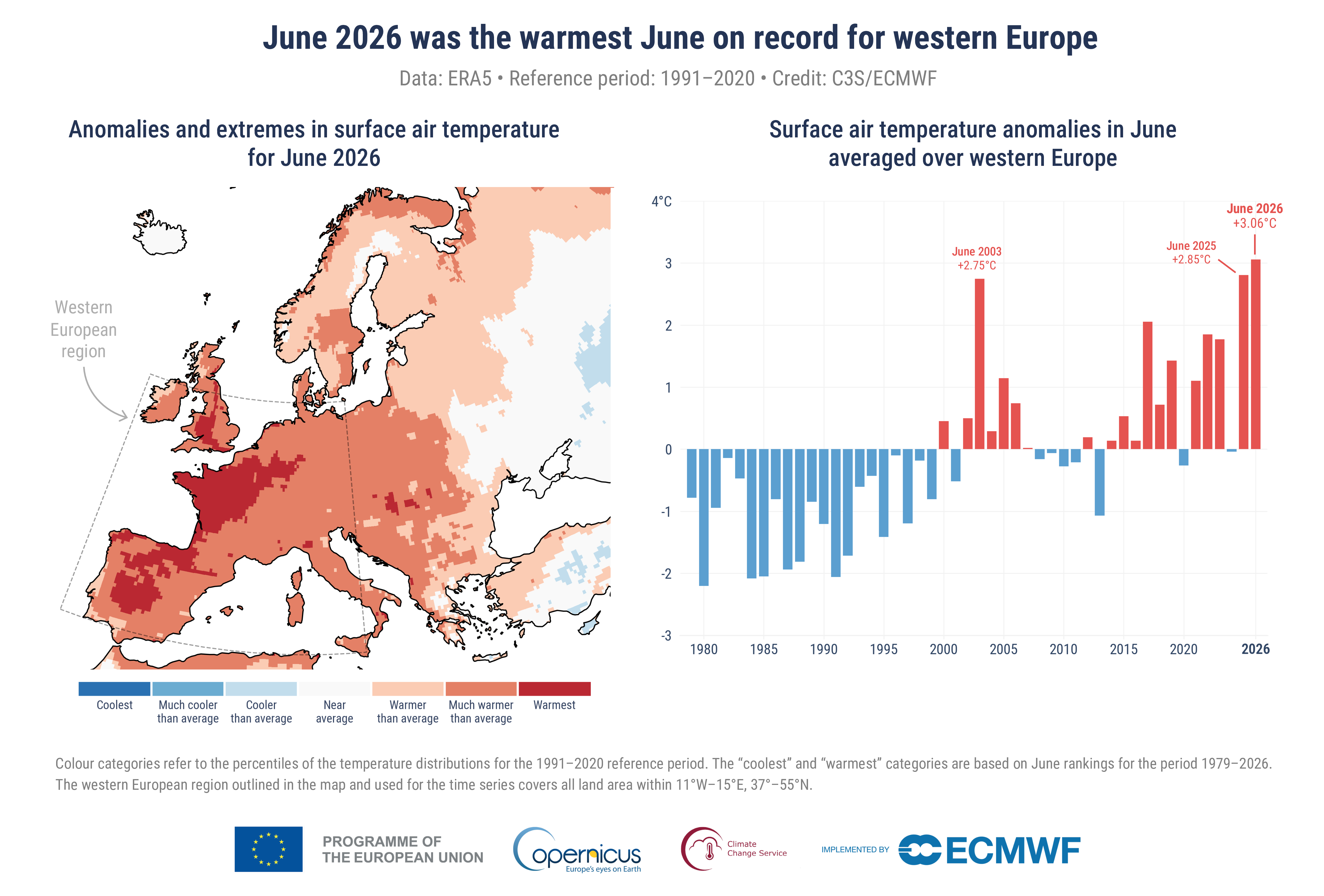
Figure 1. (Left) Map showing anomalies and extremes in surface air temperature for June 2026. Colour categories refer to the percentiles of the temperature distributions for the 1991–2020 reference period. The extreme (“coolest” and “warmest”) categories are based on June rankings for the period 1979–2026. (Right) Bar chart showing monthly surface air temperature anomalies in June averaged over western Europe (11°W–15°E, 37°–55°N). Anomalies are relative to the June average for the 1991-2020 period.
Data source: ERA5. Credit: C3S/ECMWF.
June 2026 was the hottest June recorded for western Europe and the second warmest globally. It saw near-record temperatures driven by the highest sea surface temperatures (SSTs) on record for the month, as reported by Copernicus Climate Change Service (C3S), implemented by the European Centre for Medium-Range Weather Forecasts (ECMWF).
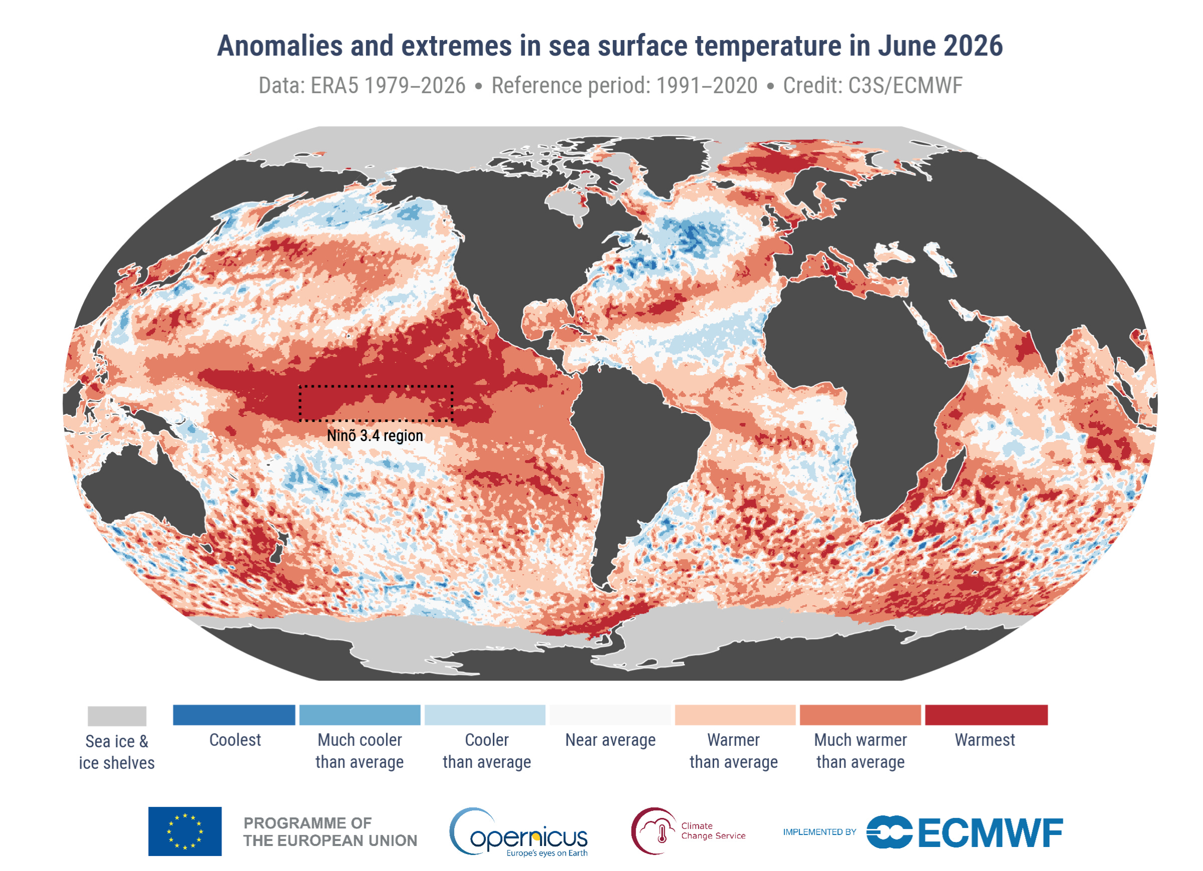
The month saw Europe hit by extreme heat over land and sea, with much of western Europe experiencing a record-breaking heatwave and marine heatwaves across the western Mediterranean and along the Atlantic coasts. Globally, the monthly average SST for the extra-polar ocean (60°S–60°N) was the highest for June, exceeding the previous record set in June 2024 by just 0.01ºC, partly reflecting the development of strong El Niño conditions in the equatorial Pacific.
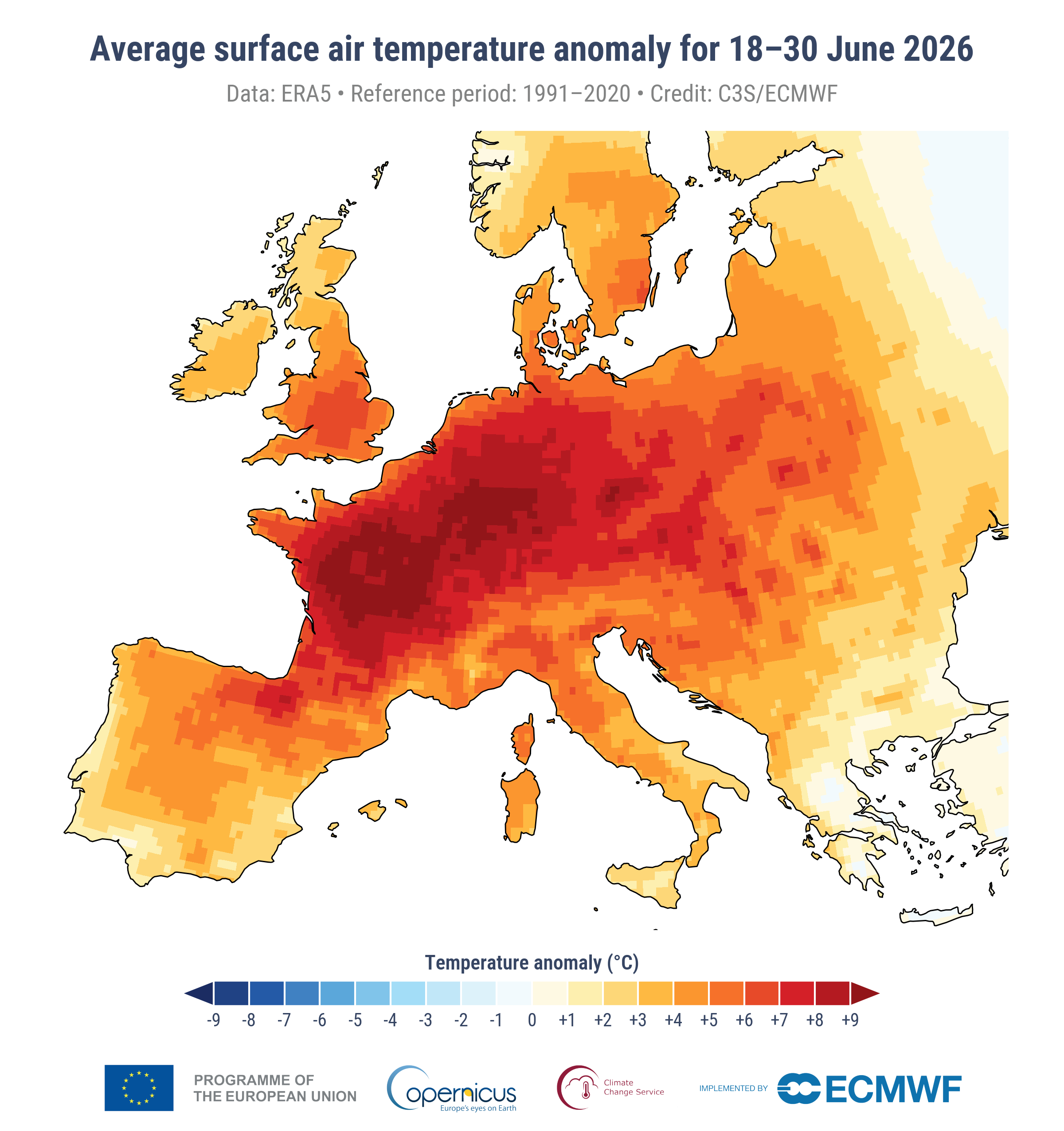
The heatwave that hit much of Europe during the second half of June came only a few weeks after a particularly intense heatwave in May, with another heatwave emerging in early July. The June heatwave broke monthly and all-time temperature records across several European countries and contributed to severe health impacts, including heat-related deaths. The succession of heatwaves illustrates the growing challenge posed by increasingly frequent and intense heat extremes across Europe and the globe. This month’s update will include an analysis of some aspects of the heatwave.
Europe also saw widespread dryness that, together with extreme heat, contributed to wildfire activity, particularly in the Iberian Peninsula and southern France, and heightened drought risk in parts of eastern Europe. The June heatwave occurred against a backdrop of increasingly dry soils across western and central Europe, further exacerbating drought conditions that had begun to develop during May’s heatwave.
Samantha Burgess, Strategic Lead for Climate at ECMWF, commented: “June 2026 underscored how profoundly the climate is changing. Western Europe recorded its warmest June on record, and continued record warmth in the global ocean. Together, these records reflect a climate system continuing to accumulate heat. The result is increasingly intense heatwaves, a persistently warm ocean, and growing risks for people, ecosystems and infrastructure across Europe and beyond.”
Figure 2: Average anomalies in surface air temperature during the heatwave from 18 to 30 June 2026 relative to the average temperature for the 1991–2020 reference period.
Figure 3. Anomalies and extremes in sea surface temperature for June 2026. Colour categories refer to the percentiles of the temperature distributions for the 1991–2020 reference period. The extreme (“coolest” and “warmest”) categories are based on June rankings for the period 1979–2026. Values are calculated only for the ice-free oceans. Areas covered with sea ice and ice shelves in June 2026 are shown in light grey. The map outlines the Niño 3.4 region used to monitor El Niño conditions.
Data source: ERA5. Credit: C3S/ECMWF.
June 2026 – Surface air temperature and sea surface temperature highlights
Global temperature
June 2026 was the second-warmest June globally in the ERA5 dataset, with an average surface air temperature of 16.54°C, 0.56°C above the 1991-2020 average for the month, behind June 2024.
June 2026 was 1.39°C above the estimated pre-industrial 1850-1900 average.
Sea surface temperature
The average SST for extra-polar oceans (60°S–60°N) in June 2026 was the highest on record for the month at 20.86°C, but only marginally higher (by 0.01°C) than June 2024.
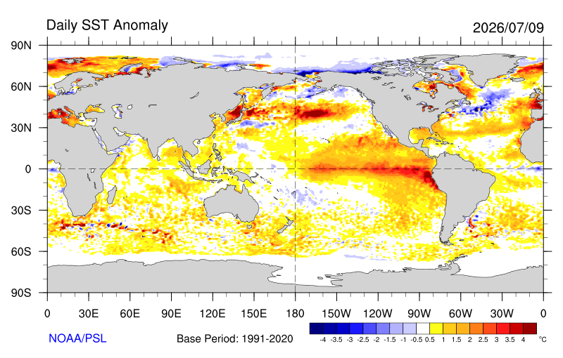
SSTs remained at exceptionally high levels across a large portion of the tropical Pacific where El Niño conditions are present and forecast to strengthen rapidly in the coming months.
Europe
The average temperature over European land in June 2026 was the second-highest on record for the month, at 19.14°C, 1.78°C above the 1991-2020 average for the month, behind June 2019.
During the second half of the month, an intense heatwave affected much of western and central Europe, with many June and some all-time records for daily maximum temperature being broken in several countries.
Western Europe, the region most affected by the heatwave, experienced its warmest June on record, with an average temperature of 20.74°C, 3.05°C above the 1991–2020 average for June, surpassing the previous record set in June 2025.
June 2026 – Hydrological variables highlights
In June 2026, much of western continental Europe, including Italy, large parts of central and eastern Europe, and southern UK experienced drier-than-average conditions, associated with persistent high-pressure and heatwave conditions.
Dry conditions increased drought risk across parts of eastern Europe and contributed to wildfire activity, particularly in the Iberian Peninsula.
Consistent with the widespread drier-than-average conditions and extreme heat, river flow was below average across Europe, affecting large parts of France, much of central and eastern Europe, and parts of north-eastern Europe.
Conversely, Iceland, Ireland, much of the UK, the North Sea coast, Fennoscandia, the Baltic States, Greece, and a large region north of the Caspian Sea were wetter than average. In some areas, heavy precipitation led to localised flooding and associated impacts.
Above-average river flow occurred only in relatively limited areas in June, mainly in Ireland, northern parts of the UK, parts of southern Iberia, southern Greece, Türkiye, and parts of the Baltic States and Scandinavia.
The global extra-tropical regions that experienced wetter-than-average conditions included parts of North America, easternmost Asia, southern Africa and Australia, with flooding reported in several regions.
Drier-than average conditions were seen in parts of USA and Canada, parts of South America, the Middle East and Central Asia and Russia.
June 2026 – Sea ice highlights
In the Arctic, monthly average sea ice extent in June was about 5% below average, ranking sixth-lowest for the month.
Regionally, the Arctic sea ice cover was below average in most marine sectors, particularly in the northern Barents Sea around Svalbard and Franz Josef Land.
In the Antarctic, monthly average sea ice extent in June was about 8% below average, ranking sixth lowest.
Sea ice cover was much below average in the Bellingshausen Sea, while it was above average in the Amundsen and eastern Ross Sea.
- End –
More information about climate variables in June 2026 and climate updates of previous months as well as high-resolution graphics can be downloaded here.
Other useful links:
Answers to frequently asked questions regarding temperature monitoring can be found here.
Follow near-real-time data for the globe on Climate Pulse here.
More on trends and projections on Climate Atlas here.
Access key datasets easily with the new tool ERA Explorer App here.
Information about the C3S datasets and how they are compiled:
Temperature and hydrological maps and data are from ECMWF Copernicus Climate Change Service’s ERA5 and ERA5–Land (surface soil moisture) datasets.
The findings about global sea surface temperatures (SSTs) presented here are based on SST data from ERA5 averaged over the 60°S–60°N domain. Note that ERA5 SSTs are estimates of the ocean temperature at about 10m depth (known as foundation temperature). The results may differ from other SST products providing temperature estimates at different depths.
Sea ice maps and data are from a combination of information from ERA5, as well as from the EUMETSAT OSI SAF Sea Ice Index v3.0.
Regional area averages quoted here are the following longitude/latitude bounds: Globe, 180° W–180° E, 90° S–90° N, over land and ocean surfaces.
Europe, 25° W–40° E, 34° N–72° N, over land surfaces only.
More information about the data can be found here.
Information on national records and impacts:
Information on national records and impacts is based on national and regional reports. For details see the respective temperature and hydrological C3S climate bulletin for the month.
C3S has followed the recommendation of the World Meteorological Organization (WMO) to use the most recent 30-year period for calculating climatological averages and changed to the reference period of 1991-2020 for its C3S Climate Bulletins covering January 2021 onward.
More information on the reference period used can be found here.
About Copernicus and ECMWF
Copernicus is the Earth observation component of the European Union’s Space programme, looking at our planet and its environment to benefit all European citizens. The programme is coordinated and managed by the European Commission and implemented in partnership with the Member States and European organisations.